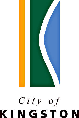
City of Kingston Logo
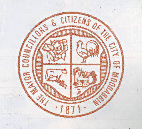
Logo of the City of Moorabbin. Courtesy Kingston Collection.
The new City of Kingston was established in December 1994 but it was not until October 16, 1995 at the Moorabbin Arts Centre that the logo of the new municipality was revealed. It was a departure from the traditional designs of the former municipalities incorporating sea shells, beach, seagulls, rooster, vegetables and cow, reflecting to some extent the economic activities of the early days within the boundaries of the various local authorities. The City of Moorabbin had previously departed from the tradition when in 1991 it commissioned Noni Edmunds to design a new letterhead and a corporate logo presenting Moorabbin as a City of Opportunity. In this project Edmunds seized on an environment theme; using golf courses as the focus as there were many world-class sand belt courses located in the City. But the administrators of the new municipality, Kingston, wanted something more than this.
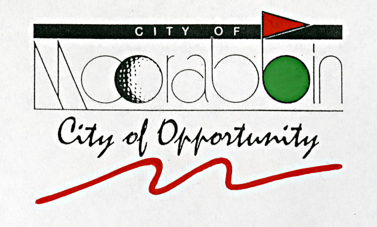
Moorabbin Golf Logo. Courtesy Kingston Collection.
Graeme Calder, the Chief Commissioner of the new municipality, commented, ‘It was important that we didn’t just look at the existing logos and modify or adapt them. We want people to recognise this logo wherever it may be on signs, in shopping centres, on Council cars, on major roads – all over the City. Above all we want people to realise it’s their logo and to feel proud to live in Kingston.’[1]
The brief, given to designers who wished to tender for the task, listed four principles; first the design would express people’s pride in their City, secondly the design would be simple with an uncluttered look, thirdly the final logo had to be adaptive to a variety of uses, and finally it had to be something with which people would identify. [2]
Fifty designers responded to the invitation to submit ideas and from this group three were short listed and asked to expand upon their submissions. From this more limited group Meg Robertson Design was given the challenge of producing the final package. It was John Magart of that organization who designed the logo and its implementation on letterhead, brochures, banners, reports and community displays.
Information derived from a process of community consultation was made available to the designers. A survey conducted in the March and May editions of Kingston Your City revealed that quality of life was a central theme. People also wanted Council to enhance and protect Kingston’s natural environment and in particular they felt a ‘protective ownership’ in its extensive foreshore, its rivers, creeks, wetlands, parks, gardens and vast sandbelt areas.
Courtesy Kingston Collection.
In unveiling the new logo, Chief Commissioner Calder said the green in the symbol represented recreational and environmental areas; the ochre strip the sandbelt, the foreshore and the area’s fertile soil, and the blue the city’s thirteen kilometres of beach front. The reaction of citizens varied. Some complimented the designers whilst others thought it a waste of money.
Commissioner Lorraine Bennett who praised the logo for its simplicity and elegance pointed out the cost of $26,460 for the design and $16,223 for production was relatively inexpensive in relation to what other new municipalities had spent on the exercise. This view was not shared by former Mordialloc councillor Frank Denvir who saw the $42,000 as an ‘absolutely disgusting waste of ratepayer’s money,’ and believed a competition among the area’s secondary school students would have been the ‘safe and sensible way to go.’ [3] Bill Nixon, also a former councillor for Mordialloc agreed. A competition amongst school children was the appropriate approach, but more importantly he believed the new logo was deficient because it gave no impression of what the City was about. Ron Brownlees, the last Mayor of Moorabbin, was more complimentary in that he saw the new logo capturing some of the major elements of the district; the beach, the sandbelt, and the parks and wetlands. His positive views were shared by Les Williams the last mayor of the City of Chelsea.
A similar diverse range of views was identified in a street poll conducted by the Moorabbin Standard News. Many of those interviewed concentrated on the ‘outrageous price’ for the design and its implementation, with some believing the money would have been better spent on beautifying the City. A few were just against change. ‘Why do they keep changing things and confusing everybody?’ Nevertheless, despite the cost ‘for three lines of colour,’ many appreciated the distinctive nature of the design and recognized the council was going to exist for some time so the investment was worthwhile.
The logo of the City of Kingston maintains its unique identity amongst municipal signage in the State of Victoria. The early reactions to it by citizens and ratepayers of Kingston have passed and it continues to grace public buildings, Council reports and banners presenting a message of a beautiful environment that needs protecting and nurturing.
Footnotes
- Kingston Your City, October 1995.
- Ibid.
- Moorabbin Standard, 25 October 1995.
